Setting up the Storefront - Article
Summary
The Storefront configuration determines how training is presented, structured, and accessed across your learning platform. By enabling and configuring Storefront settings, administrators can design targeted catalog experiences that support discovery, engagement, and scalable learning distribution.
In this article you will learn:
- How to enable the Storefront for registered and unregistered users
- How to configure Storefront settings and structure the learning catalog
- How layout elements such as rows, banners, and carousels shape the experience
- How audience controls tailor the Storefront for different user groups
Depending on your use cases, you can configure your Storefront incrementally, aligning each step with your needs for personalization and scale. If this is your first time setting up a Storefront, we recommend reviewing the guidance in the introductory Storefront article to help you choose the right starting point and configuration approach.
Enable the Storefront
When a new platform is provisioned, the Storefront is not fully configured by default, allowing you to make a deliberate first decision: whether to use it as an internal course catalog for registered users (users with an account), or to also make it available to unregistered users who can browse content and create an account as part of the journey.
To enable the storefront, proceed to Settings → General and in the Self enrollment section, specify whether you wish to provide a storefront for both registered and unregistered users. Once you save your choice, the Storefront is available for configuration.
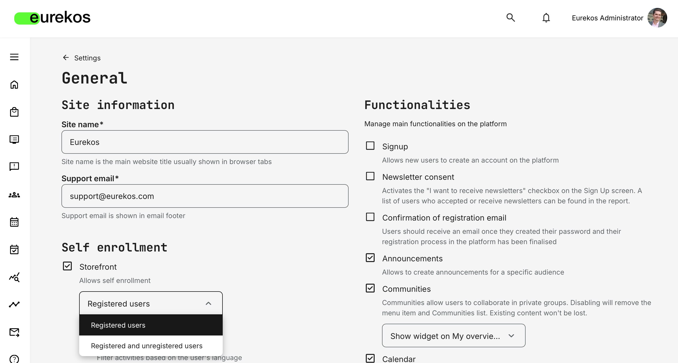
When setting up the Storefront for the first time, it is best practice to limit access to registered users only. This helps avoid accidental search engine indexing or premature exposure of training descriptions and offerings.
To safely design and test an external-facing Storefront, you can instead use a dedicated vocabulary tag to create trial users and apply audience controls to simulate external access. This approach allows you to build, validate, and refine your “external Storefront” experience using Eurekos’ audience targeting features—before making anything publicly available.
Even when you open the Storefront to unregistered users, you can keep [Signup] disabled under Settings → General. This allows for incremental exposure—making the full Storefront experience visible while preventing account creation until you are ready to open sign-ups.
Configure the Storefront
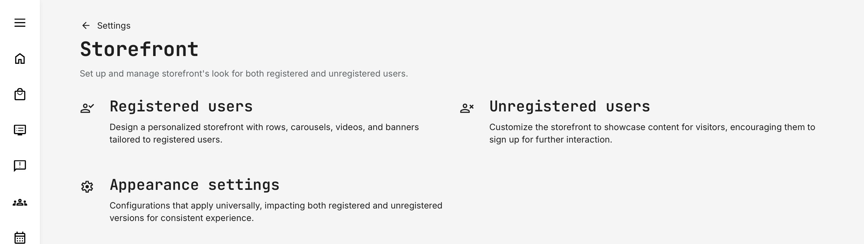
Locate the Storefront configuration under Settings → Storefront, where you can set up and manage all aspects of your Storefront. If this option is not available, you will first need to enable the Storefront—at minimum for registered users—as shown in the previous steps.
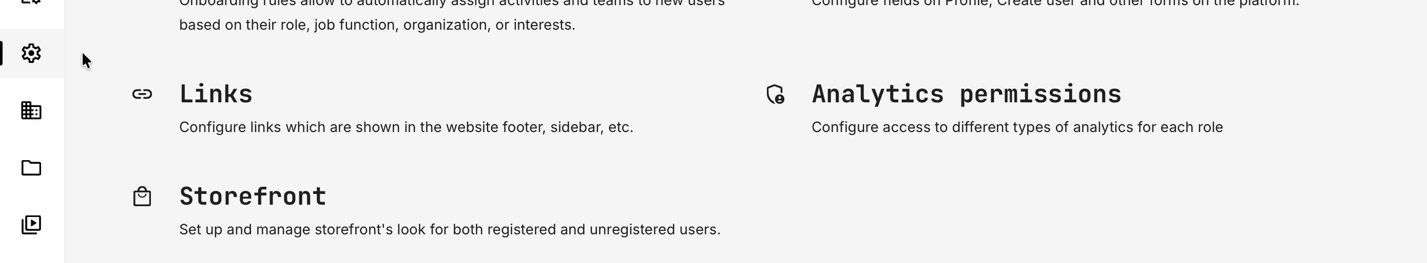
Within the Storefront section, you can configure general appearance settings as well as each Storefront individually. This allows you to tailor layouts, audience restrictions, role-based visibility, and promoted offers to match different user groups and use cases.
Based on the configuration approach described above, the Storefront is structured into the following areas:
- Registered Users: Design and configuration options for users who already have an account on the platform. This includes search functionality, curated rows, descriptive texts, carousels, videos, and banners—allowing you to tailor the learning experience based on roles, profiles, and audience rules.
- Unregistered Users: Design and configuration options for visitors who are not yet registered. This Storefront is typically used to promote training offerings, subscriptions, webinars, or programs, and to encourage further engagement such as sign-ups or registrations.
- Appearance Settings: Global visual and branding options that apply across all Storefronts, ensuring a consistent look and feel throughout your training portfolio—regardless of audience or access level.
In the sections below, we describe how to configure Storefronts for registered and unregistered users, and how to use these options together to support different user journeys.
Storefront for Registered Users
The Storefront for Registered Users serves as their central hub for trainings and subscriptions. Because registered users have completed profiles, you can apply more precise audience targeting and personalization, ensuring each user sees content that is relevant to their role, region, or responsibilities.
When you first access Settings → Storefront → Registered Users, you’ll see a simple starting layout with a search bar and a default row showing all self-enroll activities. This provides a clean canvas that you can customize—or remove entirely—to match your desired user experience.
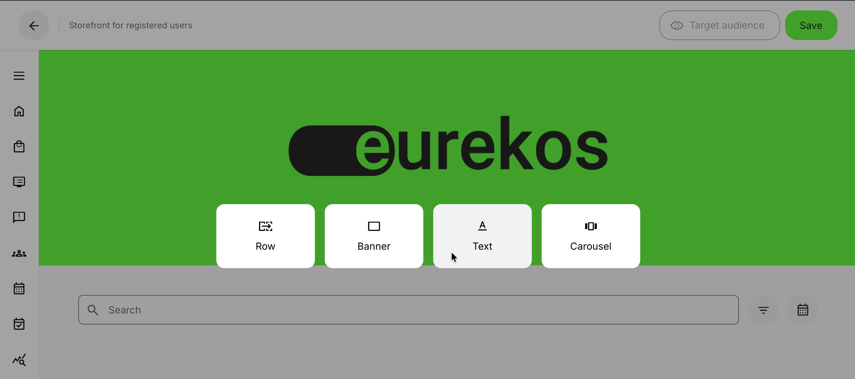
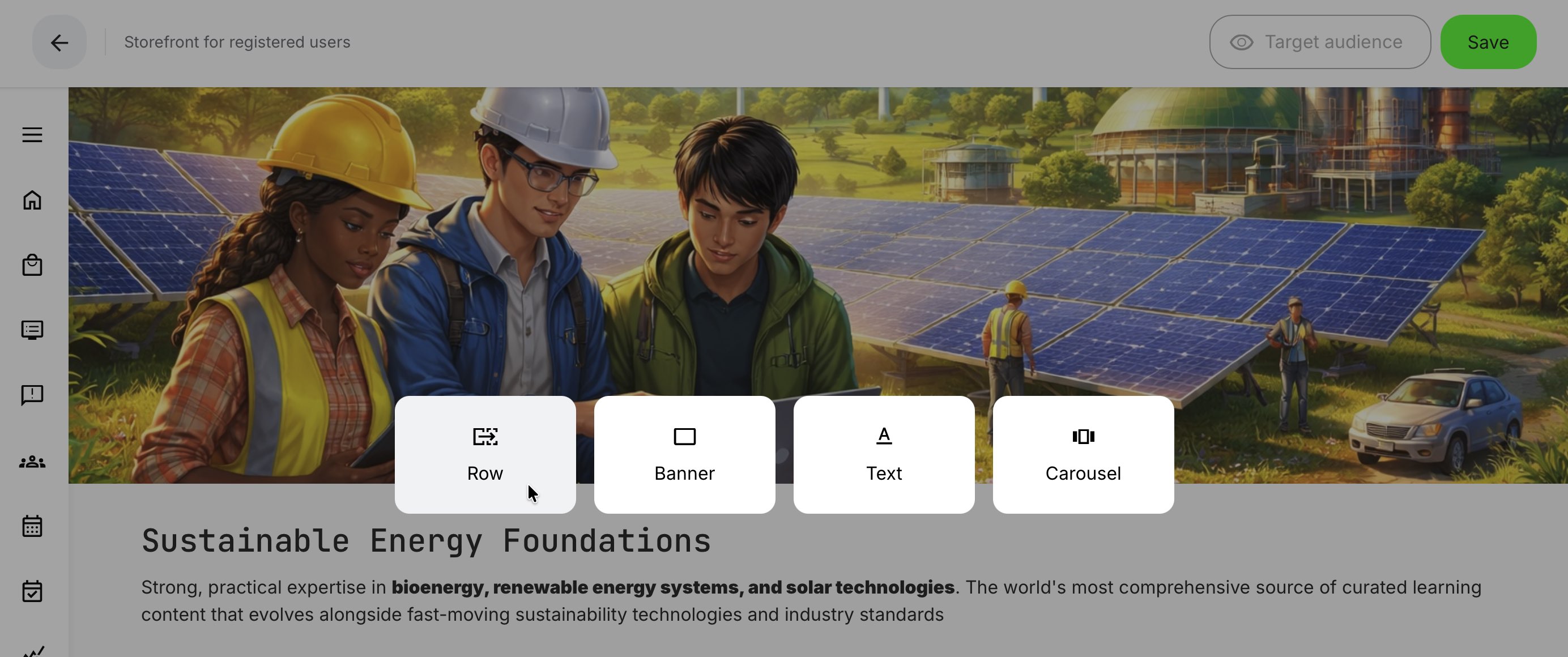
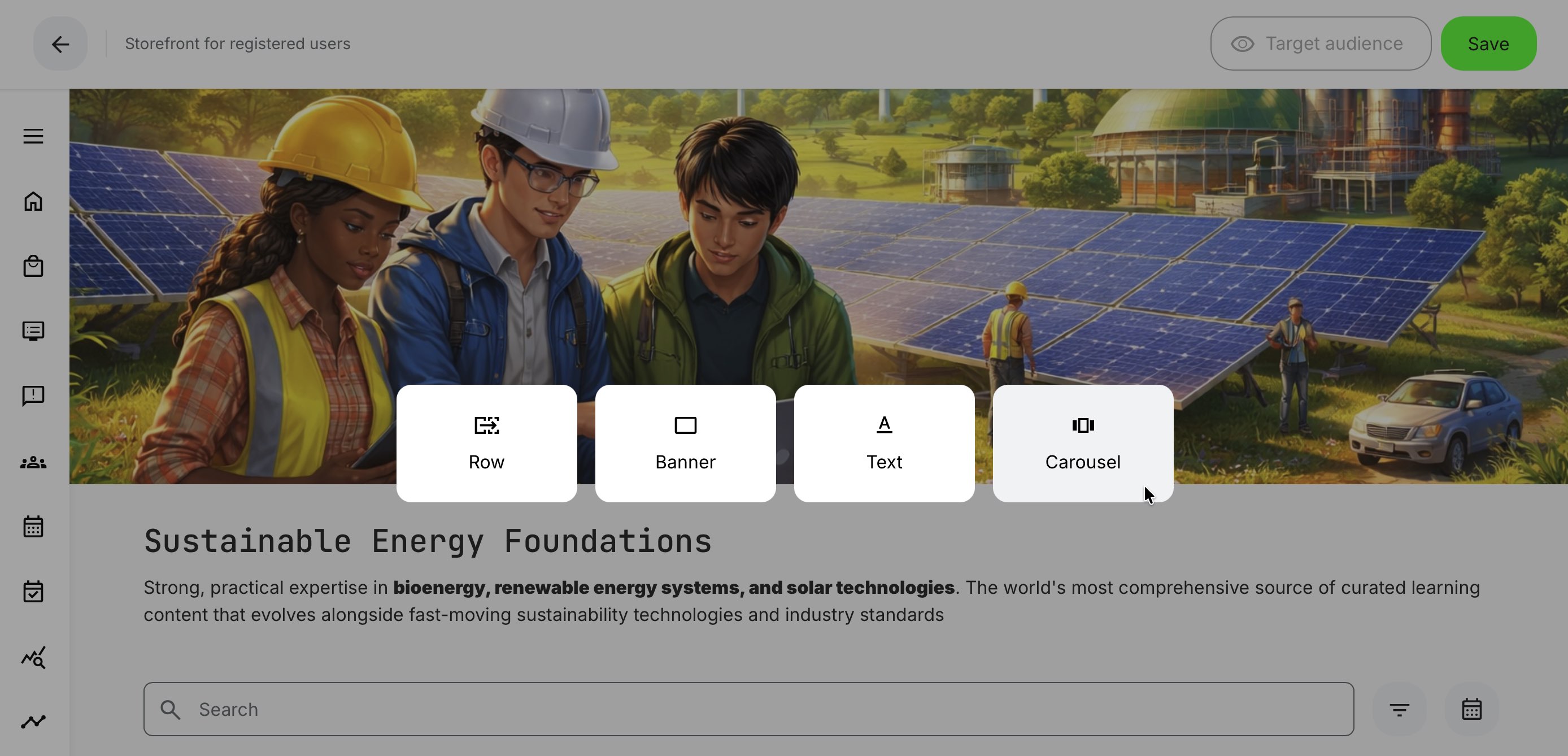
Creating a new Storefront section always begins with clicking the Add Section button – stylized as a [Plus] icon – which is located right below the central search bar or appears when hovering over any existing section on the page.
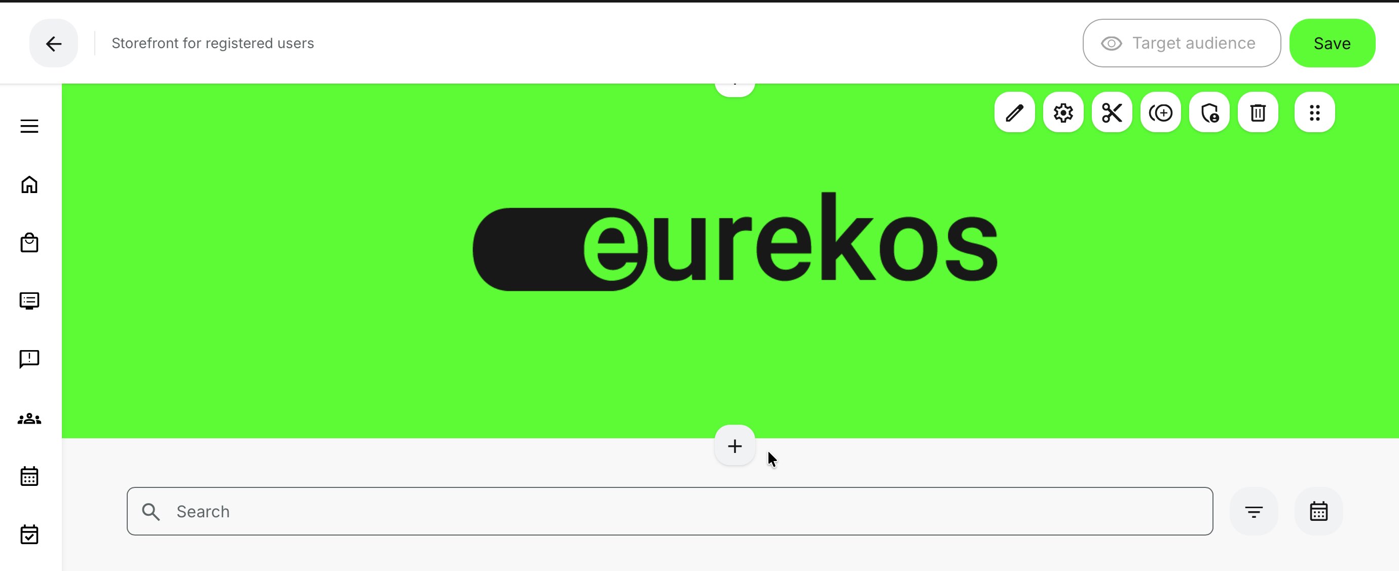
Clicking the [Plus] icon inserts a new element at the selected position—between existing elements or at the end of the page—which you can then reposition as needed. The following elements can be added:
- Search Bar: A searchable entry point for content (can only be added once per Storefront)
- Text: A text block for descriptions or promotional messaging
- Row: A list of training activities, displayed by category or individual selection
- Banner: An image or video used for branding or visual emphasis
- Carousel: A rotating presentation of selected training activities or subscriptions
All element types are added in the same way—by clicking the [Plus] icon. With the exception of the Search Bar (which can only be added once), you can insert as many elements as needed to design the user journey exactly as you want.
The [Target Audience] feature allows you to work and preview the Storefront from the perspective of specific user profiles, roles, or organizations. This is how you effectively manage personalized Storefront experiences—without creating and maintaining multiple physical Storefronts. Instead of managing “Storefront #1, #2, #3,” you configure a single, flexible Storefront that adapts dynamically to each audience with precision and ease.
Insert a Text element
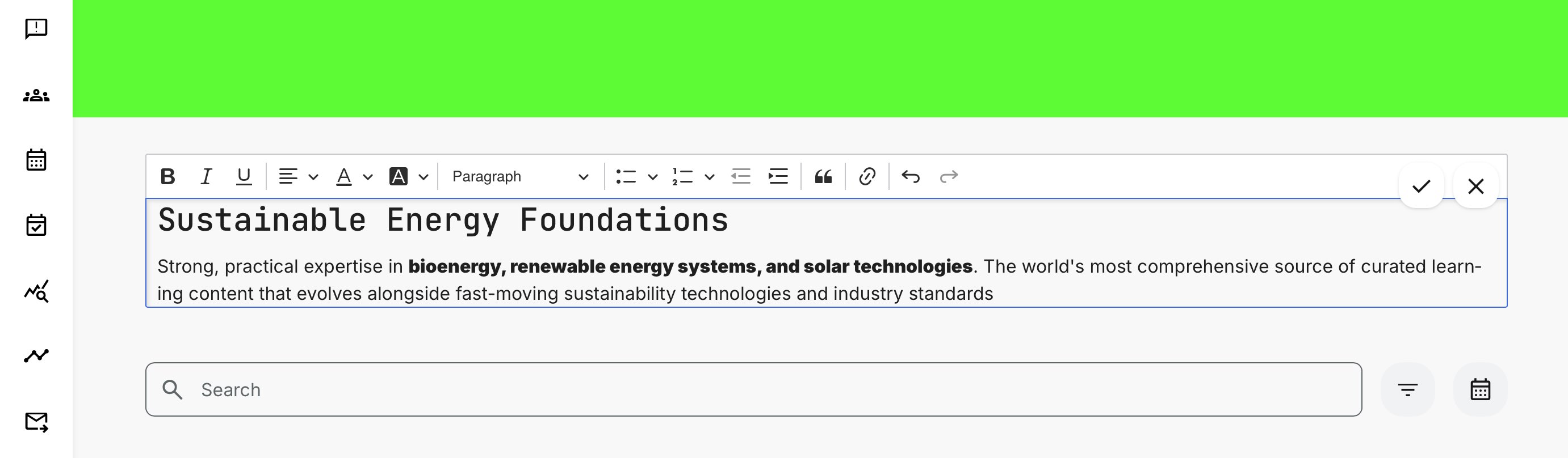
The [Text] element allows you to add customizable text blocks with formatting options and additional features. To demonstrate its core capabilities, we’ll insert a text block using the [Plus] icon between the Search Bar and the Banner.
You’ll have access to a rich-text formatting toolbar with a wide range of editing options, including:
- Text styling: bold, italics, underline
- Alignment: left, center, right
- Colors: text and background colors, with a color picker and precise hexadecimal input
- Text hierarchy: headings and paragraphs
- Lists: bulleted (3 styles) and numbered (6 styles)
- Indentation: increase or decrease paragraph indent
- Block quotes: highlight important text
- Links: insert hyperlinks
- Actions: undo and redo recent changes
Once you’re satisfied with the content and formatting, click [Save] (Checkmark icon) to commit your changes, or [Cancel] (X icon) to discard them. Other content types are inserted in the same way, with each element offering its own configuration options and features tailored to its specific purpose.
When you save an individual element—regardless of its type or configuration—your changes are immediately reflected in the live preview of the Storefront and can be edited again at any time. This allows you to work on multiple elements in parallel, committing changes per object as you go.
However, it’s important to note that these changes are not applied to the Storefront as a whole until you save the page using the [Save] button in the top-right corner. This acts as a safeguard: while element changes are visible in preview, they are not published to users until the full page is saved.
This setup also enables you to work within specific audience profiles, effectively previewing exactly what different users will see. Only once you’re satisfied with the overall result should you save the page to make the changes live. If you exit without saving, all page-level changes are discarded and your Storefront remains unchanged.
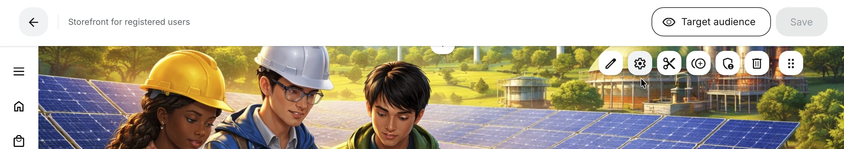
Insert a Banner element
Adding a Banner element follows the same process as other elements: click the [Plus] icon and choose either an image or a video (videos play without audio for visual effect). Both assets must already exist in the media archives to be selectable.
In this example, a default banner is already present, so we’ll simply edit it. Hover over the banner and click [Edit] (pen icon) to replace the image. The configuration steps are identical to inserting a banner for the first time.
When in edit mode, select either [Image] or [Video]. This opens the corresponding media archive, where you can choose the asset you want to use. In this example, we'll replace the current banner by selecting [Image].
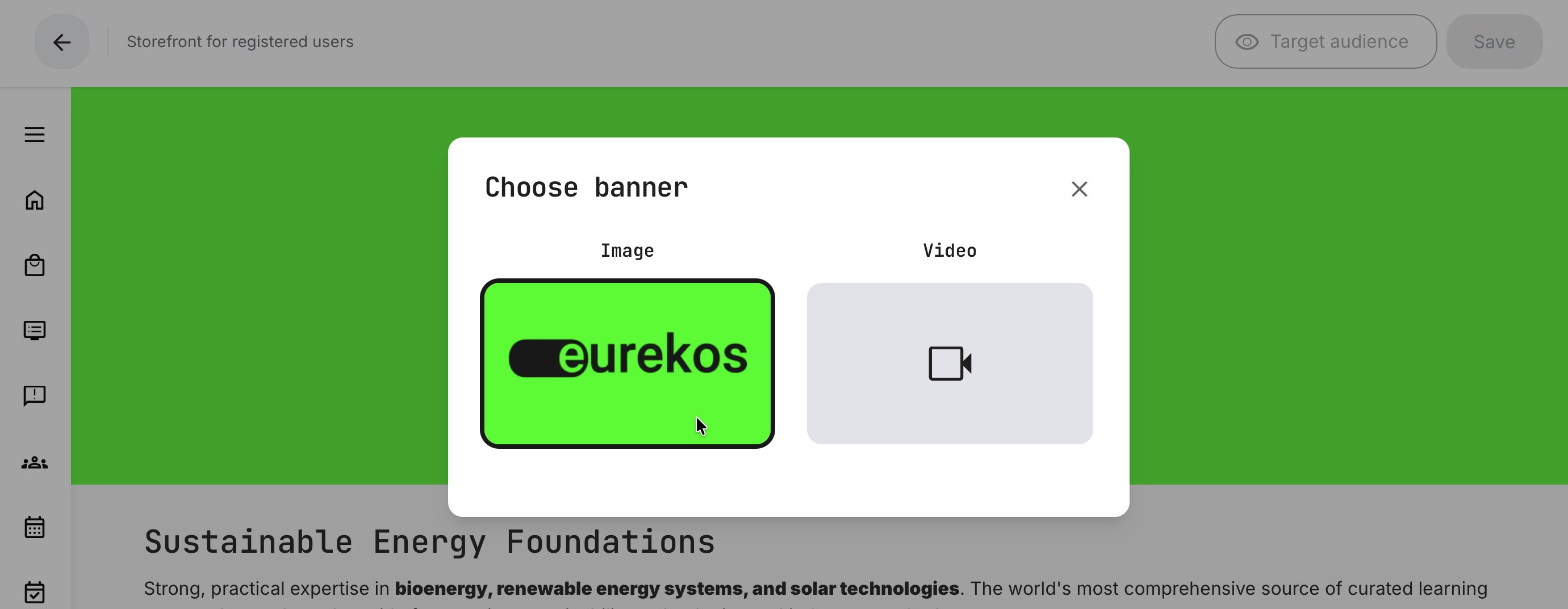
Once selected, the relevant media archive opens, allowing you to choose an image or video to replace the current one. The archive includes two tabbed options:
- My files: Shows media you have uploaded to your own archive, including any bulk uploads you’ve added previously.
- Standard files: Managed by a Platform Administrator and typically pre-populated with organization-approved, branded assets for marketing and consistent presentation.
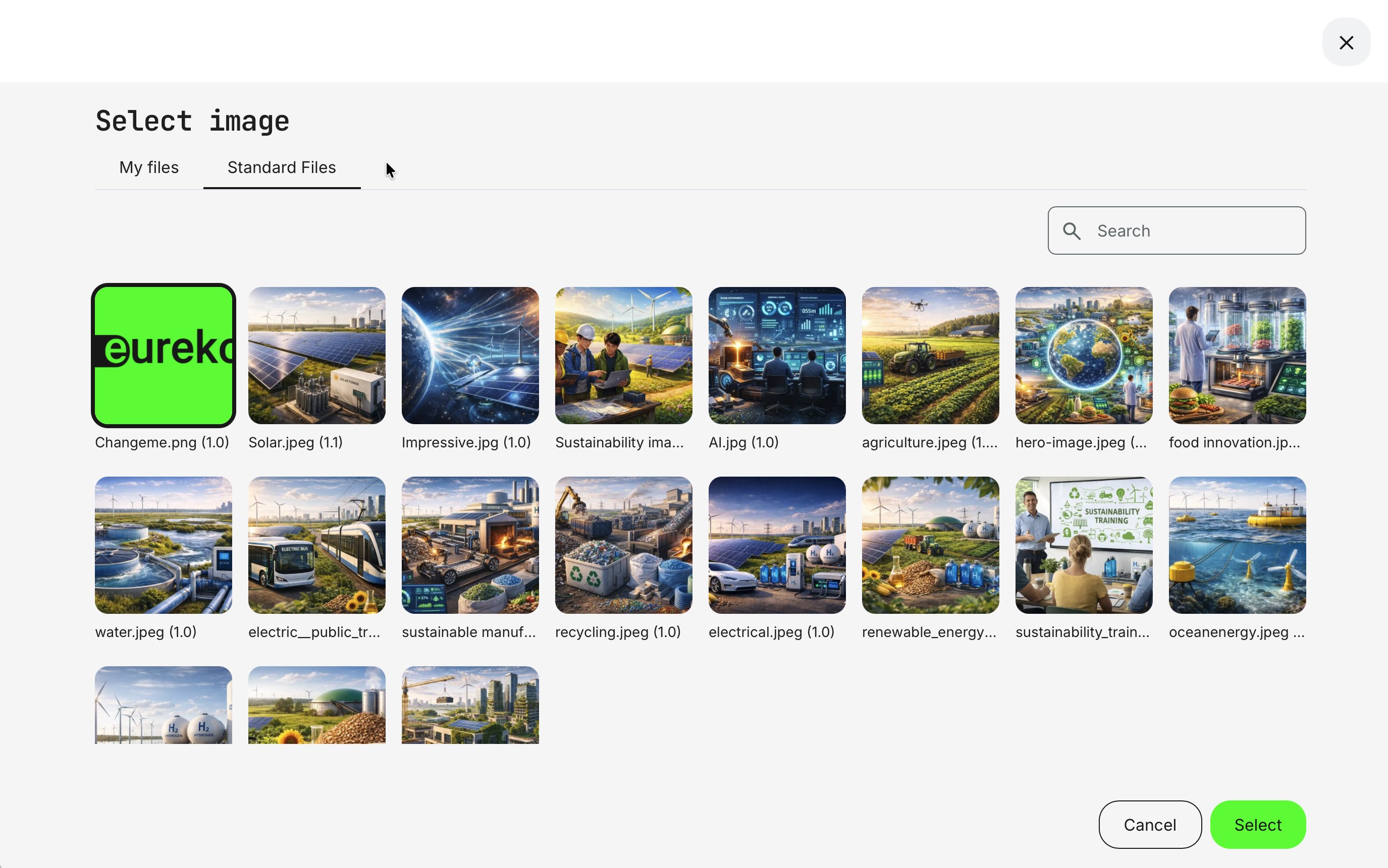
The currently used image is highlighted in the media list, which may include a folder structure and a search option to help you quickly find assets. You can select any image from My files or Standard files.
If you’re working with a video, a similar media archive is shown for videos. Once you select a new asset, it is highlighted in the list and immediately reflected in the Storefront preview. You can continue adjusting and refining your layout until you’re satisfied, then save the Storefront to commit all changes.

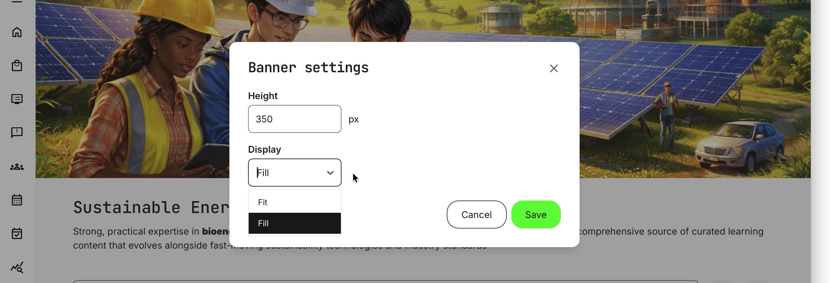
All banner elements include a dedicated [Settings] option that lets you control the banner height and how the image or video scales within the space. These settings apply equally to images and videos and are important for achieving the intended visual impact based on how the media was designed.
Access these options by hovering over the banner and clicking the Gear icon.
Banner elements offer precise control over height and display behavior, allowing you to balance visual impact with usability across different screen sizes and devices. These settings are defined in pixels and apply consistently to both images and videos.
Height: Enter an exact pixel value to control how much vertical space the banner occupies. When choosing a height, consider common screen formats and user contexts—such as large monitors, laptops, or mobile devices. While most screens follow a 16:9 ratio, resolutions can vary significantly.
Display mode:
- Fill scales the image or video to fill the full width of the browser without distorting the aspect ratio. The content is centered vertically within the defined height, and any overflow is cropped. The banner resizes responsively as the browser window changes.
- Fit constrains the content to the defined height and scales it proportionally, preserving the full image but potentially leaving unused horizontal space.
Together, these options ensure responsive behavior across devices while giving you the flexibility to choose the best visual compromise for your audience’s viewing environment.
While there are no strict limitations, we recommend using landscape-oriented banner images with a maximum height of 400 pixels. To ensure sharp, high-quality visuals, aim for a minimum width of 1280 pixels, which provides a crisp appearance across most screen sizes and resolutions.
Insert a Row element
Arguably the most important element is how you present training activities to your audience. This is done by adding a Row element—using the same process as other elements—by clicking the [Plus] icon and selecting [Row].
Within the Storefront, trainings are displayed as tiles in rows, organized and sorted according to your chosen logic, making it easy for users to discover relevant content.
This configuration lets you define what content appears in the row and how it is presented across your learning catalog. You can choose anything from simple, automatically populated lists to highly curated, manually ordered selections—ideal for highlighting new product releases, featured programs, or upcoming offers.
Rule of thumb: For all row types, it’s important to note that only training activities enabled for self enrollment are shown by default. This safeguard helps prevent activities—such as on-premises sessions or invite-only offerings—from appearing publicly by mistake.
The one exception is subscriptions. Subscription rows can include training activities that are not generally available for self-enrollment, allowing you to grant access exclusively through the subscription without exposing those activities in the public Storefront.
Overall, five main row configuration types are available, each supporting different presentation needs:
- All: The simplest option. Displays all training activities available for self enrollment. Ideal for getting started quickly or when you have a small catalog
- Vocabulary: Uses one or more vocabularies (tags) applied to training activities. You can combine classifications such as Sustainability, Water, and Forest to surface only relevant content. Because vocabularies are managed at the activity level, rows update automatically as your catalog evolves—making this a highly maintainable option
- Free: Displays all training activities that are available at no cost. Useful for onboarding, trial content, or promotional learning offers
- Custom: Lets you manually select and order specific training activities. This is ideal for structured presentations such as certification tracks (e.g., Foundation → Advanced → Expert) or curated learning journeys where sequence matters
- Subscription: Displays content included in a subscription, enabling users to explore what’s available within their access. You can create multiple subscription-based rows and further filter them by activity categorization—particularly useful when subscribers have access to a large catalog and benefit from seeing content grouped into focused sections similar to what is experienced on popular film streaming services
All row types share three mandatory settings: a Title, Row size , and a Sorting option.
- Use the Title field to name your row in a way that’s relevant to your target audience. Translation support is available via the [Language] icon, allowing you to define different titles for users with different language profile settings—or, for anonymous users, based on their browser language when translations are configured
- Rows can be configured to display a fixed or custom number of training activities—between 8 and 32 items—without requiring users to click [Show more]. This allows you to adjust visibility based on relevance, importance, and the size of the category or offering being presented
- Several sorting options are available, with some options depending on the selected row type
Together, these options give you fine-grained control over how learning content is discovered, promoted, and consumed—without duplicating content or creating separate Storefronts.
Row type: All
The simplest approach is to list all training activities enabled for self enrollment in a single row—showing, in this example, a maximum of 8 items.
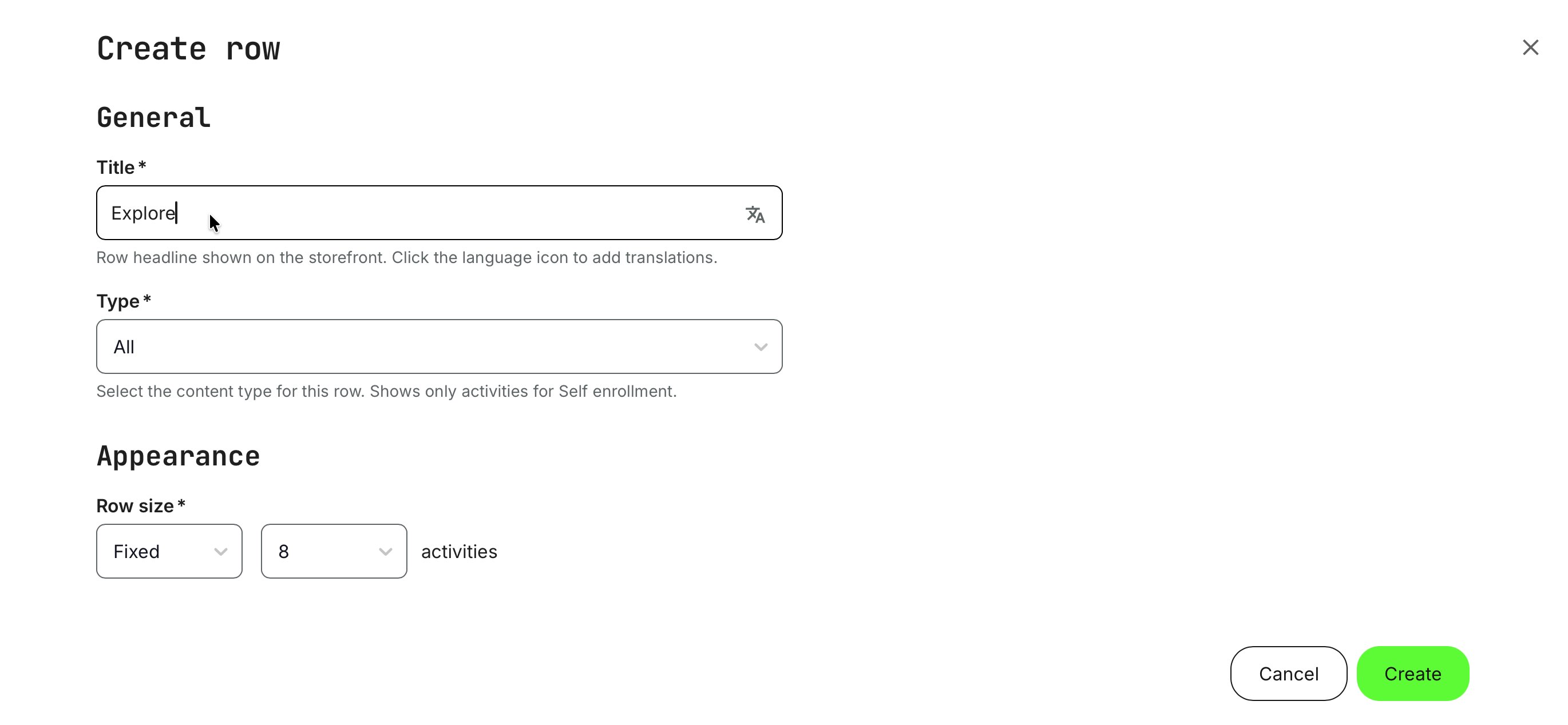
Once you click [Create], the row is immediately displayed exactly as it will appear to your audience, clearly showing both its content and layout—regardless of which row type is used.

Sorting within a row is described in detail below for all row types. For the “All” row type, sorting uses the personalized sorting option by default. This algorithm takes multiple factors into account and adapts dynamically based on whether the viewer is a registered (logged-in) user or an unregistered (anonymous) visitor, ensuring the most relevant content is shown first for each audience.
Each tile within a row displays the title, description, price, and other key details, all of which are defined centrally under Settings → Commerce. Here, you control which types of information are shown, making it easy to maintain consistency across the Storefront.
This centralized configuration helps users quickly understand the offering while allowing you to tailor the presentation to your business model and commercial strategy—keeping the experience clear, focused, and relevant.
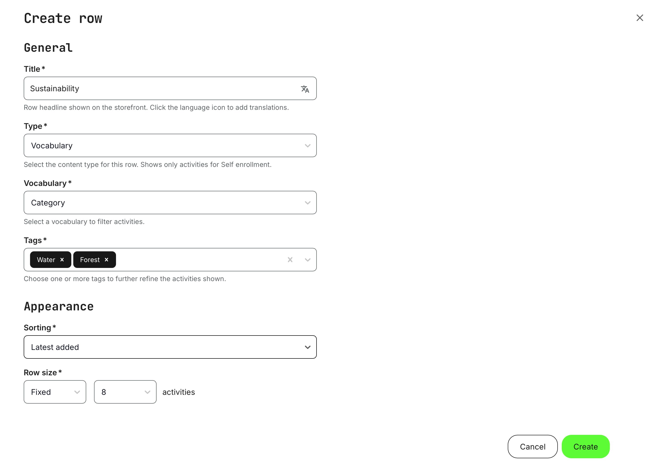
Row type: Vocabulary
Rows let you group and present training activities in business-relevant, logical combinations, such as focus areas like Environmental, Information Security, or more granular subcategories within each domain.
Each row can reference one vocabulary at a time, but that vocabulary may contain many tags, each linked to different training activities. The selection logic works as follows:
- Selecting a top-level (hierarchical level 1) tag—for example Sustainability—will display all training activities tagged with Sustainability, including those that also carry any of its subcategory tags (such as Water, Forest, or Waste). This is because no restriction has been applied at the subcategory level
- Selecting multiple top-level tags within the same vocabulary will include training activities that have any of those tags applied (logical OR), not only those that have all of them
- Selecting only subcategory (hierarchical level 2) tags—for example Sustainability → Forest—will display only training activities tagged specifically with Forest. If you select Forest and Water, only activities tagged with either of those subcategories will appear, excluding other activities tagged only at the top Sustainability level
You can immediately see the effect of your selections when you click [Create], making it easy to fine-tune the row until it presents exactly the content you want.
Another key advantage of using vocabularies is how much they simplify ongoing maintenance. Once you’ve established a solid tagging structure and continue to enrich your content portfolio, rows are automatically populated based on your configuration—across multiple audiences and with the correct sorting—keeping manual administration to a minimum.
To put this into perspective, tagging allows you to create highly targeted rows that display only specific training activities—based entirely on how you organize and apply your vocabularies. The most commonly used vocabulary is Category, which is a good place to start for simplicity. However, vocabularies can also be combined, acting as logical AND conditions, so only activities matching all selected tags are shown.
Tagging is applied at the training activity level, and rows simply reflect those tags. For example, if you tag activities with labels such as “Webinar Q2 EMEA” or “Conference”, you can easily create a row that displays only those activities, giving them a clear and distinct presence on the Storefront.
You are free to name tags and create as many as needed within existing vocabularies. There are no technical or administrative constraints on how tags must be used—this structure is intentionally flexible so you can organize and present your training catalog according to your business needs and audience strategy, not predefined system limitations.
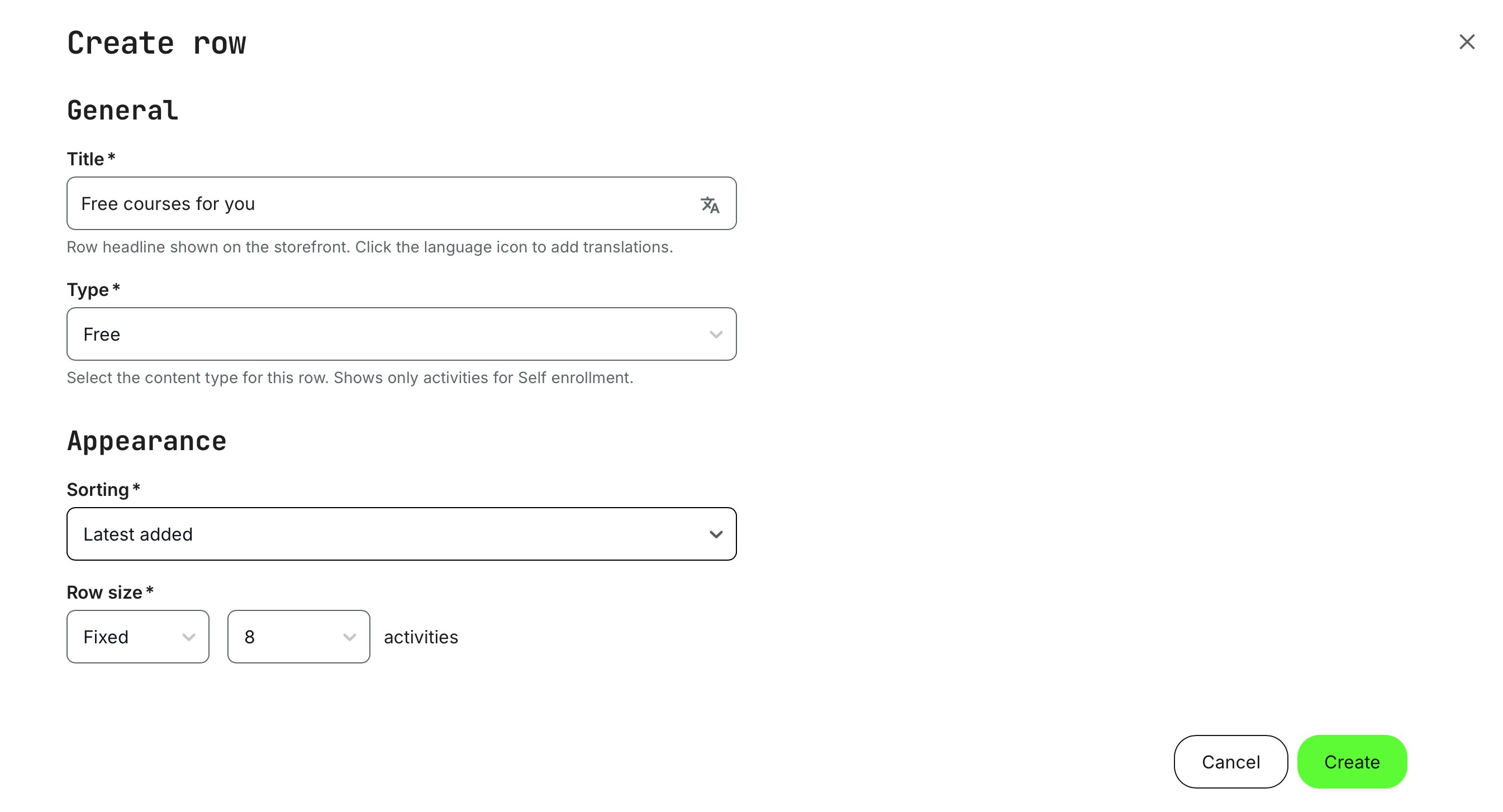
Row type: Free
This option checks the commercial configuration of each training activity and displays those marked as Free, regardless of whether they are also part of paid offerings or subscriptions. Typical examples include public webinars, teaser courses, or limited-access modules designed to drive engagement.
It provides administrators with a simple way to showcase all free content in a dedicated Storefront section, while still allowing those activities to appear in other relevant rows. As with other row types, you can control how many items are shown and how they are sorted, aligning the presentation with your content strategy and use cases.
You can immediately see the effect of your selections when you click [Create], making it easy to fine-tune the row until it presents exactly the as you need.
Row type: Custom
Custom rows allow you to curate a handpicked selection of training activities and define their exact display order. This is ideal for use cases such as tiered or accredited training paths, certification journeys, or promotional bundles where the desired structure does not align with vocabulary-based tagging. Custom rows give you full control over both the content and the sequence in which it appears, ensuring precise presentation for specific business or learning objectives.
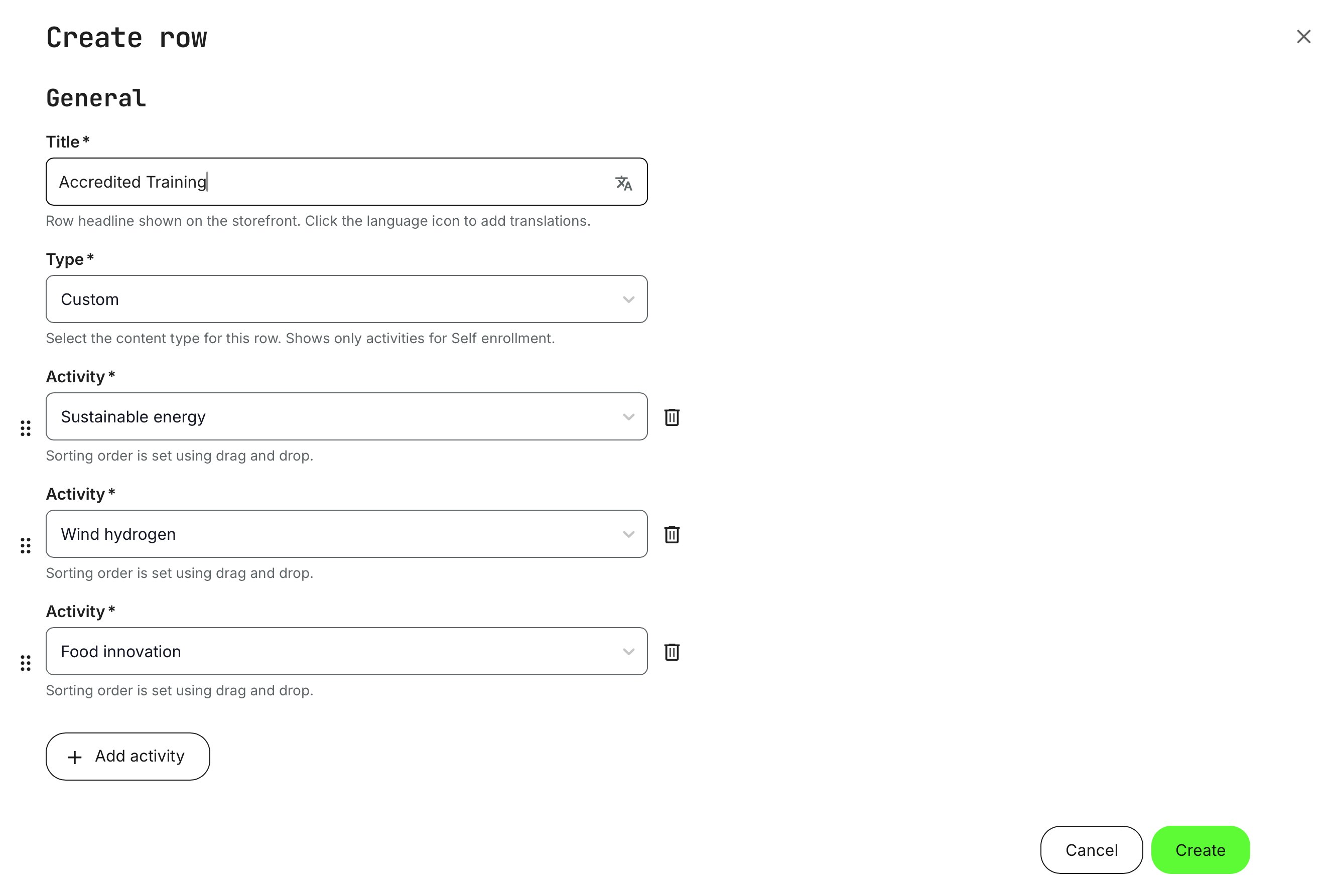
Click [Add activity] to include additional training activities in the custom row. Use the six-dot drag handles to reorder items, and remove activities using the [Trash can] icon.
If the [Add activity] button appears disabled, it means you have reached either the maximum number of items allowed for the row or there are no additional training activities available for self-enrollment to add.
You can immediately see the effect of your selections when you click [Create], making it easy to fine-tune the row until it presents exactly the as you need.
Row type: Subscription
Subscriptions are essentially curated packages of individual training activities. In the Storefront, they can be presented as rows that preview the included content before purchase, helping users understand the value of the subscription at a glance.
By selecting an existing active subscription from the dropdown, its included training activities are automatically displayed in the row. This provides transparency and makes it easy for users to explore what’s included prior to subscribing. Subscriptions and their advanced configurations are covered in detail in separate articles.
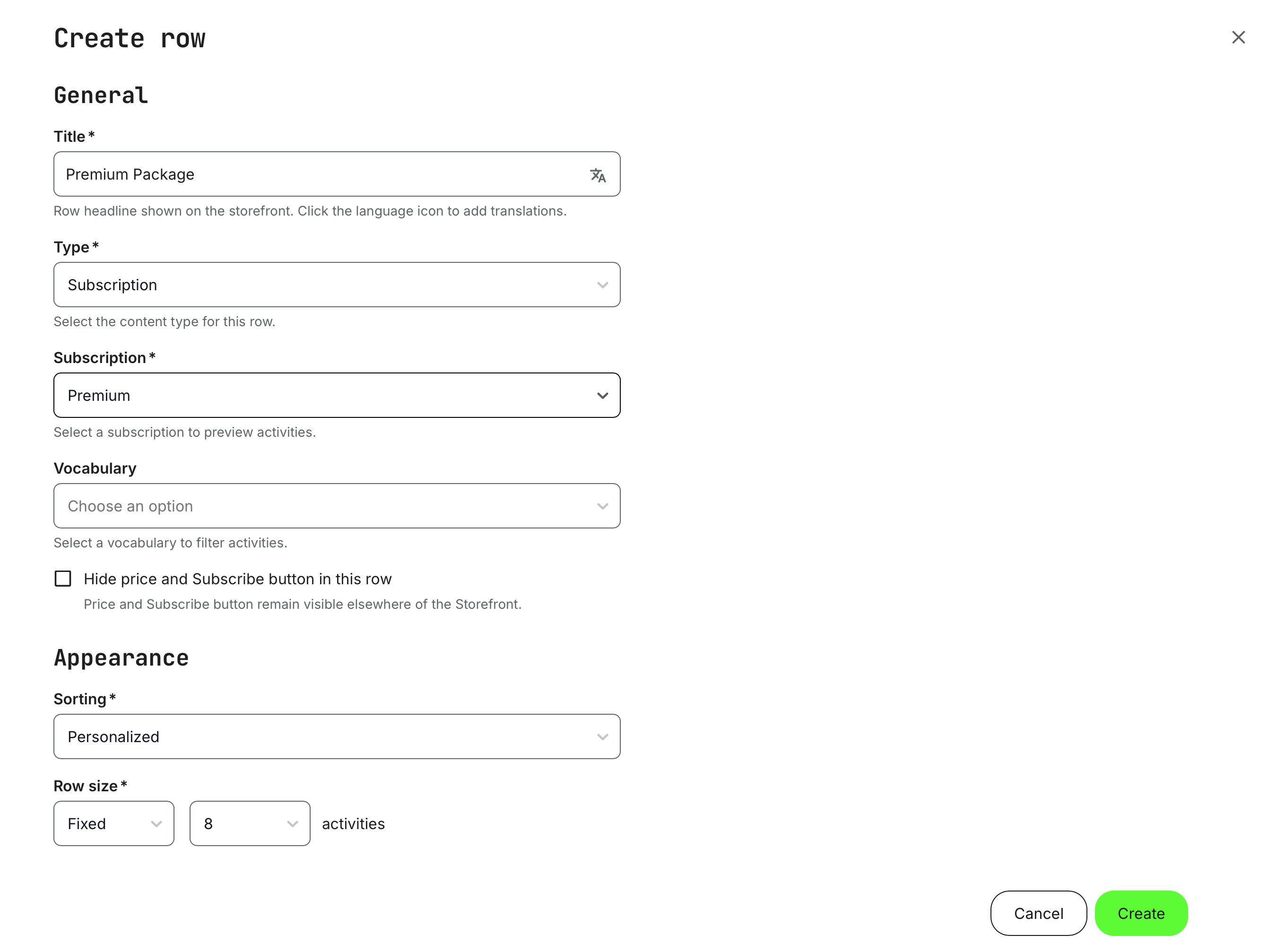
Reference to keep in mind: For subscription rows, a particularly useful audience control is “Subscribed”, which allows you to display multiple rows that segment the subscription into thematic sections instead of presenting all content in one large, cluttered row. These rows are only visible to registered users who are subscribed, creating a more focused and relevant experience for active subscribers.
As subscriptions can cover many different use cases—especially those with large and comprehensive content catalogs—you may want to further structure how subscription content is presented. This can be done by combining subscription rows with vocabularies to create clearer, topic-based navigation.
A subscription row can also be filtered using vocabularies in the same way as regular rows. This means you can display only a subset of the subscription’s content, based on tags, while still ensuring that all shown activities belong to that specific subscription. Each subscription row can reference one vocabulary at a time, but that vocabulary may contain multiple tags linked to different training activities.
The selection logic works as follows:
- Top-level (hierarchical level 1) tags: Selecting a tag such as Sustainability will display all training activities tagged with Sustainability, including those that also have subcategory tags (e.g., Water, Forest, Waste), as no restriction has been applied at the subcategory level.
- Multiple top-level tags: Selecting more than one top-level tag within the same vocabulary will include training activities that have any of those tags applied (logical OR), not only those that contain all of them.
- Subcategory (hierarchical level 2) tags: Selecting only subcategory tags—such as Sustainability → Forest—will display only training activities specifically tagged with Forest. Selecting Forest and Water will include activities tagged with either of those subcategories, while excluding activities tagged only at the top Sustainability level.
You can immediately see the effect of your selections when you click [Create], making it easy to fine-tune the row until it presents exactly the as you need.
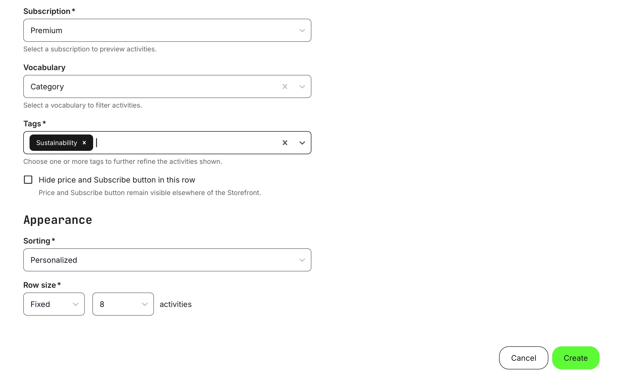
When using multiple subscription rows to segment and organize the content of a single subscription, you may want to enable the option “Hide price and subscription button in this row.” This helps avoid confusion where the same subscription price and call-to-action appear repeatedly across the Storefront, which could otherwise give the impression that multiple different subscriptions are being offered.
This option is purely a display adjustment. Users will still have full access to the subscription details, including pricing, what’s included, and the main Subscribe action when they navigate to the subscription description page or encounter the subscription through other Storefront elements. In practice, this provides greater flexibility in how subscription content is presented—allowing you to focus on meaningful content segmentation and discoverability, while keeping the commercial messaging clear and consistent.
Sorting rules within rows
Sorting determines how training activities are ordered within a row and plays a key role in guiding attention and discovery. Depending on your use case, you can choose between intelligent, personalized sorting or explicit, rule-based ordering to best match your audience and content strategy.
| Sorting type | Logic |
|---|---|
| Personalized | Content is ordered dynamically based on relevance to the viewer, using profile data, activity, and context. For anonymous (not logged-in) users:
For logged-in users:
Focused trainings are individually flagged training activities that take priority over other activities with the same vocabulary tagging. Administrators can mark activities as Focused or Unfocused, directly influencing how they are prioritized between themselves. Focused activities are surfaced first within a row and can be manually reordered relative to one another. |
| Upcoming |
|
| Latest Added | The most recently added or made available activities appear first.
|
| Highest Rated |
|
| Alphabetically (A–Z) | Activities are listed in ascending alphabetical order by title. |
| Alphabetically (Z–A) | Activities are listed in descending alphabetical order by title. |
Rows, Sorting, and Audience Control — Business Value
Rows and sorting are the foundation of how training content is structured, prioritized, and experienced in the Storefront. Rows let organizations group training activities into meaningful, business-driven collections—by category, subscription, campaign, or custom selection—while sorting determines the order in which content is surfaced based on relevance, timing, personalization, or strategic focus.
Combined with audience controls, this enables highly targeted experiences: different users can see different content, in different orders, using the same underlying catalog. The result is a Storefront that adapts to roles, regions, maturity levels, and customer segments—without duplicating content or maintaining multiple catalogs.
From a business perspective, this delivers hyper-personalization, reduces administrative overhead, increases engagement through relevance, and supports scalable monetization models such as subscriptions, certifications, and campaigns.
Row configuration overview
To make it easier to understand which row types can be combined with which sorting options, the supported combinations are summarized in a clear and easy-to-scan table below.
| Row Type | Description | Configuration options | Sorting |
|---|---|---|---|
| All | All activities available for self enrollment | Row size (4 → 32) | Personalized |
| Vocabulary | Activities categorized using vocabulary-based tags |
| All options |
| Free | Activities available free of charge | Row size (4 → 32) | All options |
| Custom | Row with hand-picked activities tailored to specific needs | Custom → 32 | N/A |
| Subscriptions | Lists activities included in the selected subscription |
| All options |
Insert a Carousel (High-impact Promotion on the Storefront)
Carousels are a dynamic and highly effective way to highlight and promote training activities and subscriptions on your Storefront. Unlike static elements, carousels introduce motion and visual flow, naturally drawing attention and encouraging interaction. This makes them particularly well suited for showcasing featured offerings, campaigns, or time-sensitive initiatives.
In Eurekos, carousels can be placed anywhere on the Storefront and are often used as an alternative to—or in combination with—traditional banners. While banners primarily serve a branding or decorative purpose, carousels act as a clear call to action, guiding users directly toward relevant trainings or subscription offers. This balance between visibility and action makes them especially effective in high-traffic areas of the Storefront.
Carousels can include:
- Training activities and subscriptions together in the same carousel, or
- Separate carousels dedicated to each type, depending on your communication strategy
They are easy to update and can be changed at any time, allowing you to adapt quickly to new campaigns, product releases, or shifting business priorities.
An important operational advantage is that carousels automatically respect training schedules and enrollment rules. Activities that are no longer open for enrollment or that have passed relevant dates are handled automatically, reducing administrative effort and minimizing the risk of promoting unavailable offerings.
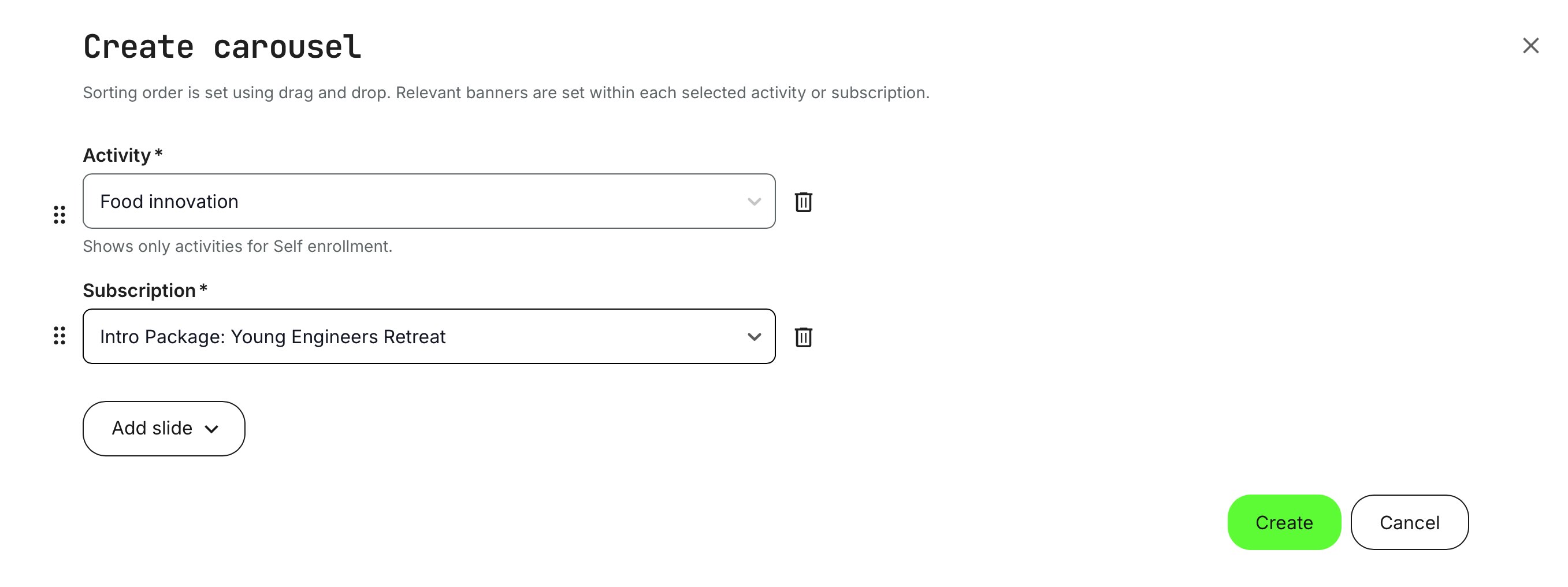
To insert a carousel, click the [Plus] icon and select [Carousel], following the same process used for adding other elements.
As you enter the carousel creation, you can add slides—each slide represents a training activity or a subscription. We recommend using two to four slides, as each slide is shown for a few seconds before rotating. Adding too many slides reduces the impact; larger sets of offerings are better presented in rows, where users can browse them more effectively.
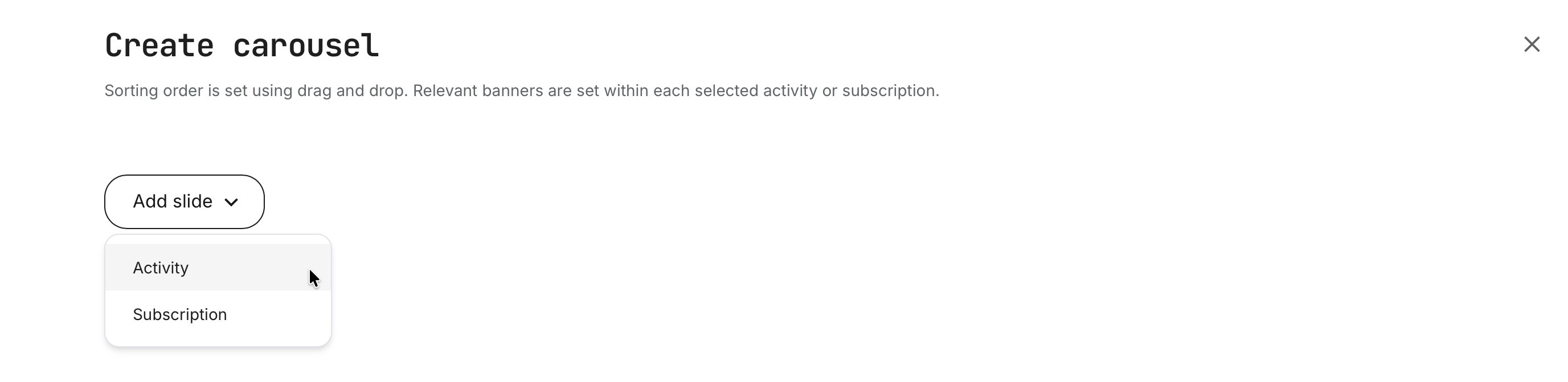
In this example, two slides are added—one Training Activity and one Subscription. You can continue adding slides using the [Add slide] option, reorder them by dragging with the six-dot handle (items higher in the list appear first), or remove a slide using the [Trash] icon.
Once you click [Create], the carousel is rendered immediately, showing exactly how it will appear to your audience.
In a carousel, each slide displays the activity or subscription title along with its short description, as defined in the Activity or Subscription. To minimize administration, always update titles and descriptions at their source—changes will automatically reflect across both rows and carousels.
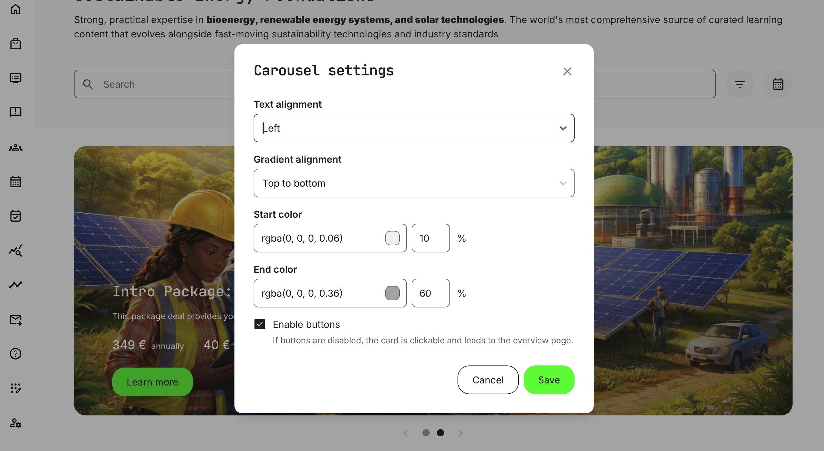
That said, the carousel element also has its own display-specific options. These are accessed by hovering over the carousel (regardless of which slide is currently shown) and clicking the [Gear] icon.
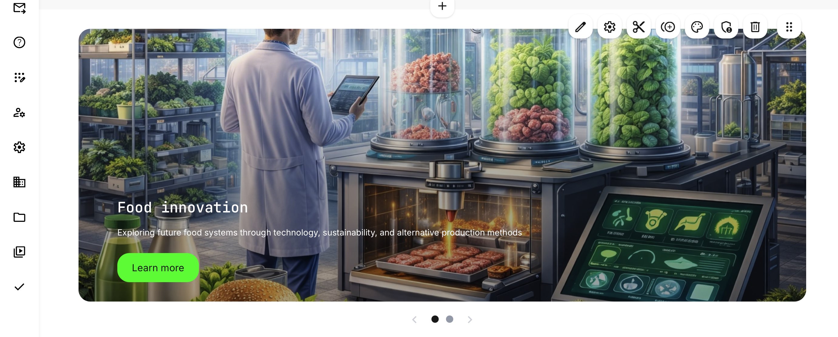
If no short description has been defined, the carousel will automatically pull text from the main Activity description. For clearer messaging and stronger visual impact, we strongly recommend creating concise short descriptions for all activities and subscriptions.
Within the carousel settings, you can fine-tune the visual presentation to align with your brand guidelines and improve clarity:
- Text alignment: Choose left, center, or right alignment to position the headline, short description, price, and call-to-action consistently. Text is displayed in white, assuming a visually rich background
- Gradient overlay: Apply a directional color gradient to improve text readability on visually complex imagery. You can control the start and end colors, transparency levels, and direction (top–bottom, bottom–top, left–right, or right–left). While well-designed artwork is always recommended, the gradient overlay serves as an effective in-carousel visual enhancement—often eliminating the need to redesign assets while still achieving strong contrast and readability
- Call-to-action button: Shown by default as [Learn more], directing users to the relevant description page for enrollment or purchase. If disabled, the entire slide becomes clickable, leading to the same destination.
Once you [Save], changes are visible immediately.
We recommend avoiding overly specific, pixel-perfect designs that rely on exact alignment between images, text, and buttons within carousel slides. User devices and screen sizes vary widely—from mobile phones in portrait or landscape to large desktop displays—making precise positioning unpredictable.
Each slide uses a single image that automatically scales and adapts responsively across screen sizes. Designing imagery with flexibility in mind—allowing for cropping, scaling, and content overflow—ensures more consistent results, easier maintenance, and a better overall experience for all users.
Insert a Search Bar
The Search Bar element can only be added once per Storefront. It includes a search input field, quick filters accessed via the [Filter] icon, and a Calendar view [Calendar] icon for browsing scheduled training activities. You can also choose to display predefined quick-filter tags beneath the search bar—based on each tag’s configuration—allowing users to quickly segment and explore Storefront content with minimal effort.
A more detailed walkthrough of search behavior, filtering logic, and result handling is covered in a separate article.

Storefront for Unregistered Users
The public Storefront is commonly used to support early-stage discovery and lead generation. Typical use cases include introducing your brand and training portfolio, showcasing campaign-based or thematic learning collections, promoting upcoming webinars or events, and acting as a gateway into subscriptions or structured learning programs. It can also be used to route visitors into specific organizational contexts through custom links, ensuring a deliberate and seamless sign-up experience.
Functionally, the Storefront for Unregistered Users offers the same layout tools—rows, banners, carousels, and visual configuration options—as the Storefront for Registered Users.
- The key difference lies in intent and restraint. Because this Storefront is publicly accessible by default, extra care should be taken when deciding which trainings to expose, how pricing is presented, and how calls to action are framed
- Many organizations start with high-level overviews, teaser content, free activities, or subscription previews, while reserving detailed or sensitive offerings for registered users
Because unregistered visitors do not yet have a user profile, personalization is naturally more limited than for registered users. However, meaningful segmentation is still possible through:
- Browser language – The Storefront adapts language and presentation based on the visitor’s browser settings
- Organizational context – Organization-specific entry points can be created using custom URLs
- Automatic organization assignment – Visitors who register through these links are automatically associated with the relevant organization, allowing audience rules and Storefront logic to apply immediately
To support safe experimentation and validation, administrators can use the [Target Audience] preview option to masquerade as an unregistered visitor, applying filters such as language and organization. This makes it easy to test how the public Storefront appears before opening it up more broadly.
In short, the Storefront for Unregistered Users is best approached as a deliberate, staged experience—balancing visibility and control—while laying the groundwork for richer personalization once users choose to engage further.
Other Design Options
Each Storefront element—such as rows, text blocks, banners, and carousels—includes a set of intuitive controls that make it easy to refine layout, appearance, and visibility. These controls are consistent with Eurekos’ native authoring tools, so they will feel familiar across the platform.
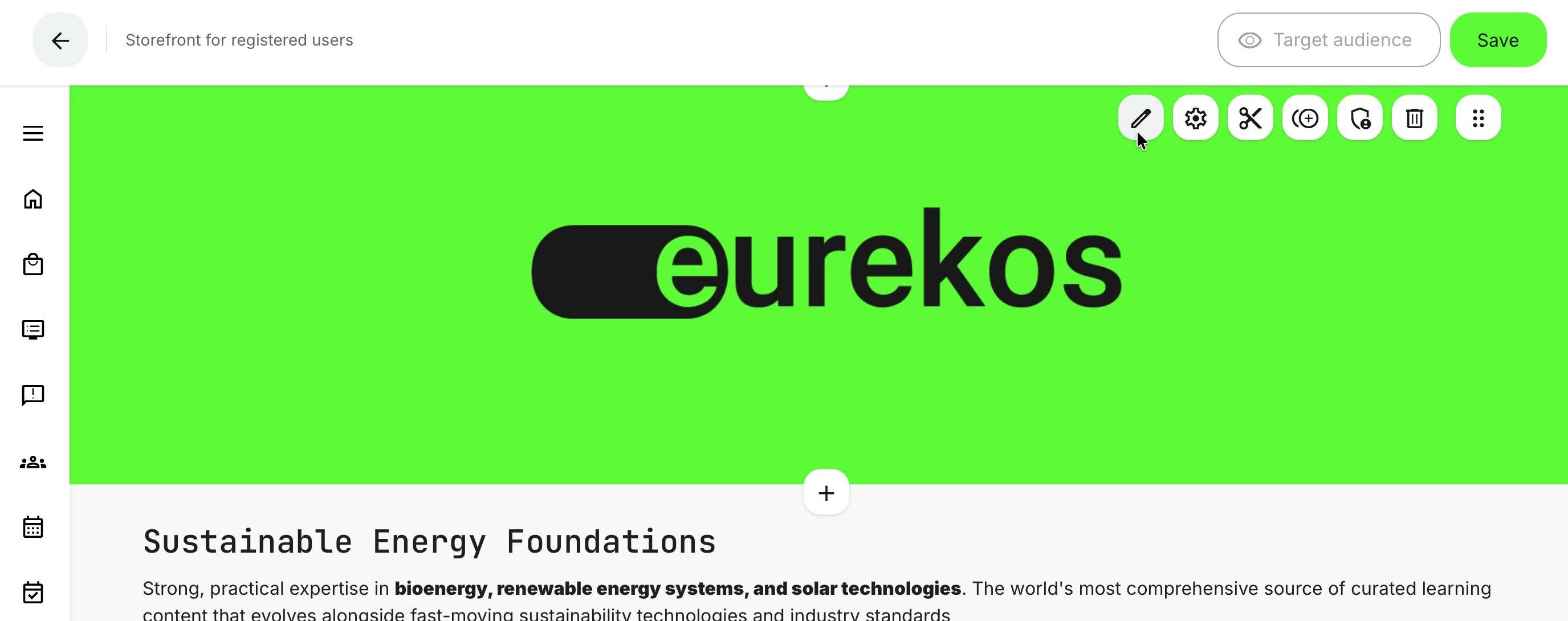
- Edit (Pen icon) – Modify the content and configuration of an existing element.
- Settings (Gear icon) – Access additional, element-specific configuration options.
- Cut (Scissors icon) – Remove an element and enable a paste option (Board icon) to insert it elsewhere. This is often more efficient than drag-and-drop on complex pages.
- Clone (Duplicate icon) – Create a copy of an element that can be pasted anywhere. Useful for creating small variations (for example, audience-specific versions) while keeping consistent styling.
- Palette (Palette icon) – Adjust visual properties such as background, text color, transparency, and borders, depending on the element type.
- Audience (Shield icon) – Control who can see the element, allowing different content (such as banners or rows) to be shown to different audiences.
- Delete (Trash icon) – Remove the element from the Storefront.
- Drag & Drop (Six-dot handle) – Reorder elements vertically on the Storefront.
The available options are summarized in the table below for quick reference.
| Type | Edit | Settings | Cut | Clone | Palette | Audience | Delete | Drag & Drop |
|---|---|---|---|---|---|---|---|---|
| Banner | ✔︎ | ✔︎ | ✔︎ | ✔︎ | ✔︎ | ✔︎ | ✔︎ | |
| Text | ✔︎ | ✔︎ | ✔︎ | ✔︎ | ✔︎ | ✔︎ | ✔︎ | |
| Row | ✔︎ | ✔︎ | ✔︎ | ✔︎ | ✔︎ | ✔︎ | ✔︎ | |
| Carousel | ✔︎ | ✔︎ | ✔︎ | ✔︎ | ✔︎ | ✔︎ | ✔︎ | ✔︎ |
Multilingual behavior in the Storefront
The Storefront is multilingual by default, and how language is applied depends on whether the visitor is registered or unregistered. To keep this simple, the behavior can be understood from that perspective.
Unregistered visitors are not logged in, so language selection is based entirely on the browser’s language settings. If translations are available, the Storefront will automatically render content in the visitor’s preferred browser language.
Registered users have a language preference stored in their profile. This setting takes precedence over the browser language and is used consistently across the platform to present interfaces, content, and communications.
How language impacts different Storefront elements
To keep everything cohesive, this section provides a brief end-to-end walkthrough to establish a clear overall understanding. Each topic is explored in greater detail in separate articles, where you’ll find step-by-step guidance and deeper explanations for specific use cases and configurations.
| Storefront Element | How Language Is Handled | Practical Notes |
|---|---|---|
| System interface | Menus, buttons, navigation, and system emails follow the platform’s activated languages. | Unregistered users see the browser language; registered users see the language set in their profile. |
| Text blocks | Authored in a single language per block. | Audience restrictions allow different text blocks to be shown to different language audiences, enabling multilingual storefronts without duplicating pages. |
| Banners (images or videos) | Banners may contain embedded text within the image or video. | If language-specific visuals are required, audience restrictions can be applied to show different banner versions per language or region. Use this selectively to avoid unnecessary administrative overhead. |
| Rows (all row types) | Language is primarily driven by the underlying training activities. |
Row titles are configured directly in the Storefront and support translations via the language icon, allowing row headings to adapt to the viewer’s language. |
| Subscriptions | Created in a primary language. | Can include activities with multiple language variants; audience controls can show or hide subscriptions per language or region |
| Carousels | Follow the same language logic as rows and subscriptions. | The most relevant language version is shown based on the user’s language context |
Default and fallback language behavior
If no language match can be determined—such as when a visitor’s preferred language is unavailable—the platform falls back to the default system language configured for the platform (for example English, German, Norwegian, Simplified Chinese, or Spanish). This fallback applies consistently in all scenarios to ensure a predictable and complete user experience.
This approach allows the Storefront to support global audiences with minimal duplication, while keeping administration manageable and aligned with real-world delivery and localization needs.
Storefront Language Behavior – At-a-Glance Overview
Below is a table that summarizes how language behavior works across Storefront elements for registered vs. unregistered users for quick reference.
| Storefront Element | Unregistered Users (Not logged in) | Registered Users (Logged in) | Configuration / Notes |
|---|---|---|---|
| System interface (menus, buttons, navigation, system emails) | Uses browser language | Uses profile language | Controlled by activated platform languages; profile language overrides browser settings |
| Default fallback language | Platform default language | Platform default language | Used if no suitable translation exists (e.g., English, German, Spanish) |
| Text blocks | Shown as authored unless audience-filtered | Shown as authored unless audience-filtered | One language per text block; use audience restrictions for language-specific variants |
| Banners (images/videos) | Same banner unless audience-filtered | Same banner unless audience-filtered | Language-specific banners supported via audience rules; use selectively |
| Rows (all row types) | Shows activities matching browser language if available | Shows activities matching profile language | Activity language is defined on the training activity itself |
| Row titles | Can be translated | Can be translated | Supports per-language titles via the language selector in the Storefront |
| Training activity tiles | Displays the most relevant language version | Displays the most relevant language version | Supports “available in other languages” logic on activities |
| Training activity descriptions | Language depends on activity configuration | Language depends on activity configuration | Each activity should reflect delivery language and region |
| Subscriptions | Primary subscription language shown | Primary subscription language shown | Included activities may vary by language; packages can be audience-restricted |
| Carousel slides | Follows activity/subscription language rules | Follows activity/subscription language rules | Titles and short descriptions come from the underlying activity or subscription |
| Audience targeting by language | Limited (browser + organization only) | Advanced (profile attributes, language, role, org) | Registered users enable much finer segmentation |
Registered users unlock true personalization: Profile-based language preferences combined with audience controls allow Storefronts to adapt automatically—without duplicating pages or managing separate catalogs. However, don't underestimate localization,
Appearance Settings (Global Storefront Styling)
The Appearance Settings menu (Settings → Storefront → Appearance Settings) defines the global visual configuration for your Storefront. These settings apply across all Storefronts, regardless of audience type (registered or unregistered), and provide a consistent baseline for layout, spacing, and branding.
This allows you to establish a uniform look and feel—colors, spacing, and navigation—while still retaining full flexibility to override styling on individual Storefront elements (such as rows, banners, or carousels) where needed.
- Background: Choose between a solid color using the color picker or upload a background image that spans the storefront page.
- Menu icon: Choose a menu icon from a dropdown containing Material Symbols and Icons (Google Fonts), defining the visual style of the Storefront navigation
- Padding (px): Controls the vertical spacing inside rows, affecting their overall height
- Row color: Defines the background color for rows and carousel sections, helping visually separate content from the page background
- Margin (px): Defines spacing outside rows and search sections, separating them from adjacent elements. Row padding and margin spacing are set to 32 px by default, providing a balanced and readable layout out of the box
These global settings act as your visual foundation. Individual elements can still be customized further using element-level controls, allowing you to combine consistency with creative flexibility.
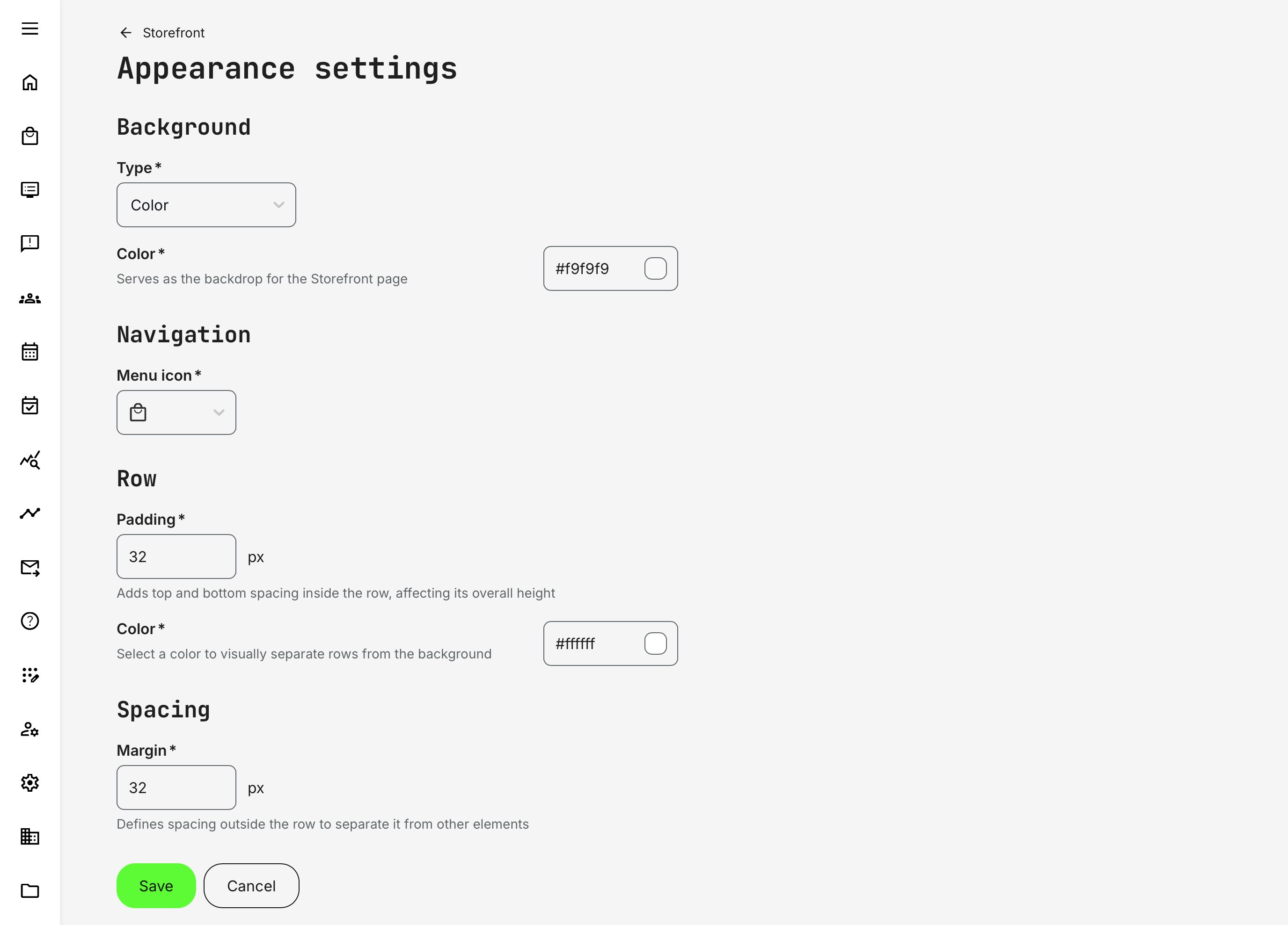
Image backgrounds are intentionally toned down by default to support content rather than compete with it. They are meant to create atmosphere and visual continuity—not to dominate the page. For most use cases, we recommend using images sized 1920 × 1080 px (16:9), which scale reliably across common screen sizes and devices while maintaining good visual quality.
For more premium or highly detailed artwork, 2560 × 1440 px (16:9) can be used to ensure crisp rendering on large or high-resolution displays. In these cases, pay close attention to file size and compression to avoid performance issues.
File format and size recommendations (JPG):
- Use JPG for photographic or complex imagery
- Target file size: 200–400 KB for 1920 × 1080 images
- Upper limit: 500 KB for 2560 × 1440 images
- Use high-quality compression (≈60–85%) to balance clarity and load time
For simpler visuals—such as gradients, subtle textures, or abstract backgrounds—scaling is more forgiving, and smaller file sizes are often sufficient. Regardless of resolution, keep important visual elements centered to accommodate responsive cropping, and always optimize images to ensure fast page loading and a smooth user experience.
FAQ
-
What happens to the Storefront when I disable Self enrollment?
You don’t need to worry—it is safe to disable Self enrollment or switch your Storefront configuration between Registered users only and Registered + Unregistered users, and vice versa.
All configuration work you’ve done—Storefront rows, audience restrictions, and even extensive setup across training activities—will be fully restored when you re-enable the Storefront. During this time, options are simply hidden from all user roles in the interface; no data or configuration is lost or altered.