13.6.0 - Release notes
Storefront Navigation - A New Explore Storefront Dropdown
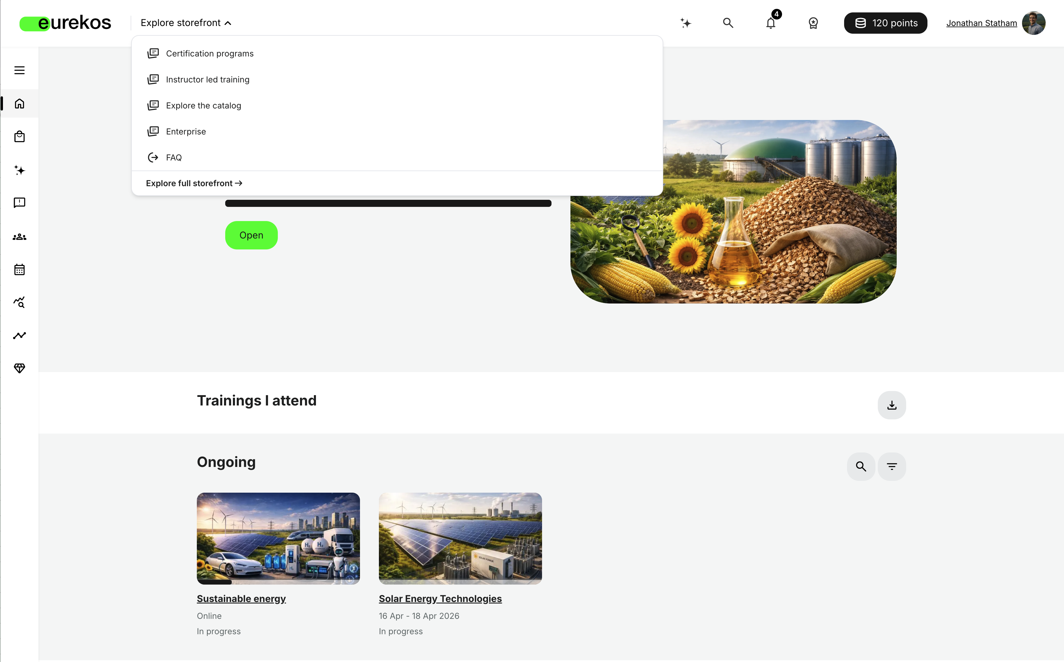
Registered users can now navigate your platform faster with a new Explore storefront dropdown in the page header, giving them instant, personalized access to your key storefront sections and any custom links you define — without leaving the page they're currently on.
The dropdown respects your existing storefront personalization: each user sees only the storefront row sections they have access to, based on that row's configured target audience. It's available on every page except while inside a training activity ("learn mode"), works on both desktop and mobile, and is fully keyboard navigable.
Features and Benefits
One-click access to your most important storefront content: Instead of browsing the full storefront every time, registered users can open the Explore storefront dropdown from anywhere in the header to jump straight to your most relevant storefront sections. On desktop, this opens as a dropdown; on mobile, as a full-screen popup. Clicking a storefront row link takes the user to that row's dedicated sub-page ("show more" page), even if it shows fewer activities than the row displays on the main storefront.
Personalized to each learner: The dropdown lists only the storefront row sections a given user can access, mirroring that row's configured target audience. This means two learners can see two different dropdowns, each reflecting exactly what's relevant and available to them, no extra configuration beyond your existing storefront personalization setup.
Custom links alongside storefront content: Beyond storefront sections, admins can add custom links (a label and a URL) directly into the dropdown, which open in the same tab. Custom links are visually distinguished from storefront row links, so users can tell at a glance what type of destination they're navigating to. Whenever the dropdown is enabled, it always closes with an Explore full storefront link, set apart from the other entries, giving users a direct route to the complete storefront.
Configuration
The Explore storefront dropdown is configured under Settings → Storefront → General settings:
- Enable the dropdown via the Enable Explore storefront dropdown checkbox (enabled by default).
- Once enabled, the page automatically lists all storefront row sections. Reorder them via drag and drop to control the order they appear in the dropdown.
- Use the visibility toggle on each row to hide or show it in the dropdown, independent of whether the row itself is shown on the storefront.
- Select Add link to include a custom link (a Label and a URL) in the dropdown.
Considerations
- The Explore storefront dropdown is only available to registered users — it will not appear on the storefront for unregistered (visitor) users.
- The dropdown's storefront row links always mirror that row's existing target audience configuration — if a learner doesn't see a particular section in their dropdown, check the row's target audience settings rather than the dropdown configuration itself, since the dropdown has no separate access controls of its own.
Storefront Text Editor - A New Image Plugin
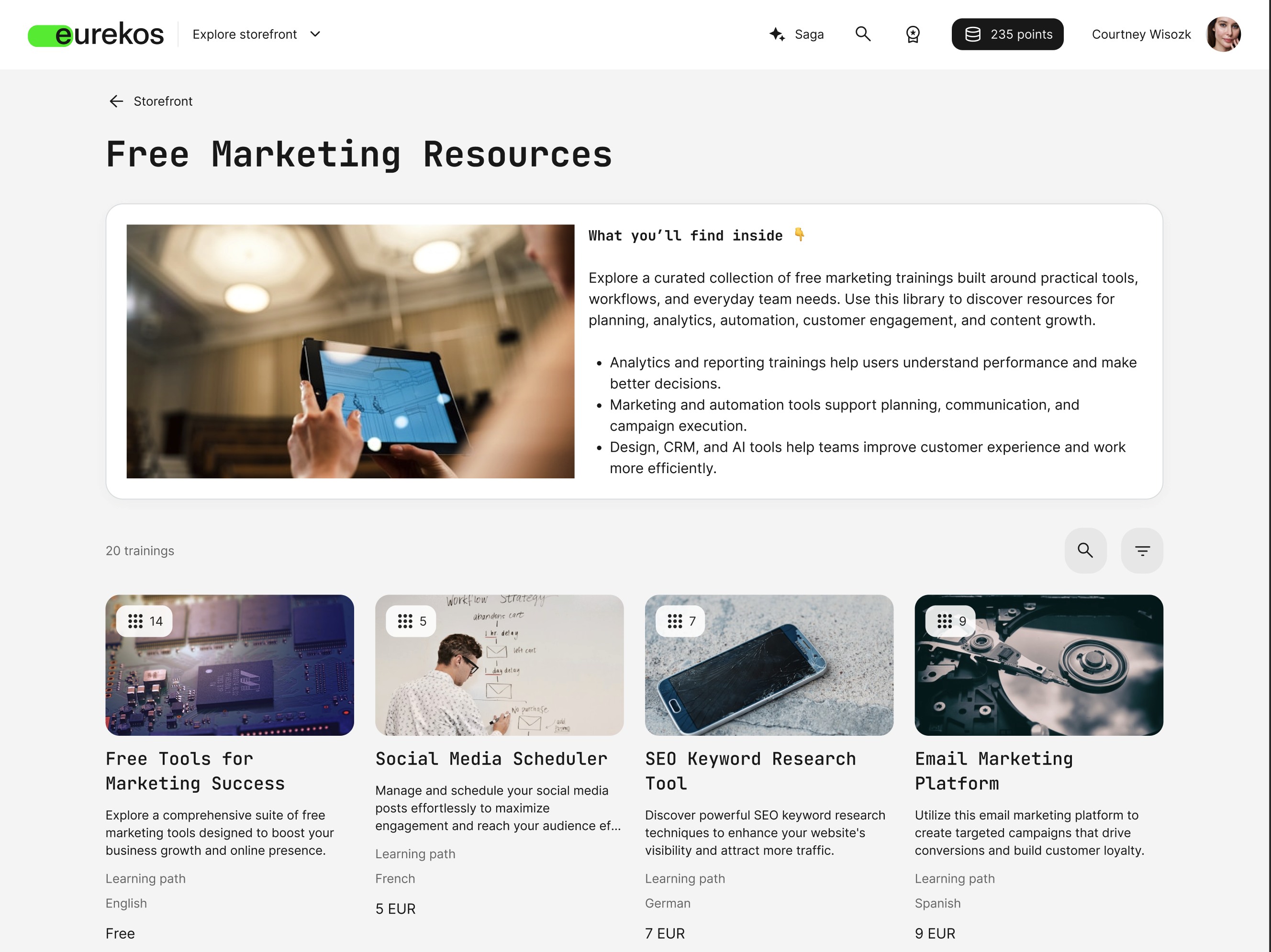
The storefront text editor now includes an image plugin, giving admins a more visual way to communicate directly on the storefront. It's available in both the main "Text" widget and storefront row page descriptions (introduced in 13.5.0), so you can easily add images to storefront content.
You can insert images from a URL or select them from the platform's file archive, then align, resize, link, and add alt text - all from within the editor.
Features and Benefits
Insert images from a URL or your file archive: Clicking the new image plugin button offers two options: insert an image via URL, or select one from the platform's file archive - from both the Standard files and My files tabs - using the same familiar flow as the course builder's image widget.
Align, resize, and link images inline: Once inserted, an image can be aligned to the surrounding text, resized by dragging its corners, given alt text, and linked to a URL - all without leaving the editor. You can also replace images later using the same controls.
Available everywhere storefront text is edited: The plugin works identically in the main storefront "Text" widget and in storefront row page descriptions, so admins get the same rich-content options wherever they're writing on the storefront.
User Instructions
- In the text editor, place your cursor where the image should appear and select the image plugin button in the toolbar.
- Choose Insert image via URL, or Select image from archive to browse the Standard files or My files tabs.
- Once inserted, select the image to reveal its controls: align it to the surrounding text, drag a corner to resize it, add alt text, or add a link.
- To swap the image later, select it and choose another image from the same toolbar.
Considerations
- Images inserted via the plugin must already exist in the file archive (or be reachable via URL), so make sure any images you plan to use are uploaded to the archive in advance.
Security Improvements 🔐
- Frontend security: Strengthened user input and DOM handling to reduce XSS risks and ensure safer rendering of dynamic content.
- Authentication security: Removed deprecated LDAP authentication components, reducing legacy code and potential attack surface.
- Token security: Updated JWT libraries to improve security and compatibility.
- H5P compatibility: Added support for H5P Core API 1.28.
- HTTP communication: Updated HTTP libraries for improved security and reliability.
- PDF generation: Updated PDF generation libraries with security and compatibility improvements.
- Content formatting: Updated Markdown processing libraries for improved security and reliability.
Shortlist of Additional Noticeable Changes
- Corrected data formatting in report exports: We've corrected data formatting in report exports across Analytics; exported cells now use the appropriate data type for each column (numbers, text, dates), so reports no longer need manual reformatting after each download. This builds on the same correction already made to the Progress report export in 13.2.0 and now extends it across all report exports in Analytics.
- Sent emails log for admins: A new Sent emails log - under Settings → Email sending - lists every system email the platform has sent, with columns for date, recipient, type, subject, and status. Admins can search by subject, body, or recipient email/name; filter by email type and a date/time range; and sort by date or type. Clicking a subject opens the full email content on a dedicated View email page.
- Re-certification on reactivation: For activities connected to a certificate with re-certification enabled, canceling or letting a participant expire no longer strands the participant - reactivating the signup or enrolling them again automatically starts a new re-certification attempt, provided the certificate's re-certification period is still active.
- Questionnaire responses reset on cancellation: For self-enrollment activities restricted by a "Submit questionnaire" requirement, canceling a participant now also removes the previously submitted questionnaire response from analytics. If the participant enrolls again, they're asked to submit the questionnaire once more.
- Global mandatory/optional control for activity tags: A new Activity tags page under Settings → Forms lets you control every activity tag field from one place — toggling each field enabled/disabled and, for most fields, required/optional. Language keeps its existing behavior (drag-and-drop ordering only, always enabled). Disabling and later re-enabling a tag preserves any values your activities already had, so you won't need to reassign them.
- Automatic renewal for managed subscriptions: The Create/Edit Managed subscription form now includes an Automatic renewal checkbox (disabled by default). When enabled, the subscription automatically continues into its next billing period when the current one ends, without the admin having to renew it manually — this repeats until the admin disables the checkbox or cancels the subscription. While automatic renewal is enabled, the "Subscription managed" reminder emails (to both the admin and the subscription owner) are not sent, since there's no manual action left to remind anyone about.